Thursday, 21 April 2016

Joiners - Work Diary & Progression

Evaluation:

In this lesson we were given the task of making a composite; this meant we had to photograph objects, or people and create a big image, using lots of smaller ones. This was interesting as it was something different to do, as we used photoshop a lot more when creating these joiner images. We could create our joiners using objects, or people. 

A photo I like:


I like this image as the edges of the stairs are still almost straight lines, therefore the image is not too abstract but you can tell it has clearly been edited. I like the different colours of the stairs, where some are darker and others are lighter, from the different angles I photographed them at. 


A photo I don't like:


I do not like this image as one of the squares are a different colour to the rest of the red squares. Furthermore, there's gaps in the image. To avoid this I could have photographed more images in order to bulk out the image and prevent there from being gaps. 


Progression:
I found it quite hard to actually join the images together themselves, as I didn't want them to appear too abstract, or too neat. This was an issue as I therefore didn't complete many as they took me a long time. If I was to recreate these images then I would vary my tone, colour (black and white) to vary my images further. 


Thursday, 24 March 2016

Thursday, 3 March 2016

Computer Experiments

Invert-
command J to copy layer
command I to invert image


This changes the image overall, making it appear more spooky than previously as you cannot clearly see the identification of the individual.


Blending-
command J to copy layer 
change the box option from normal to preferred one

In this image I chose the option 'hard light.'
This changes the image by making the colouring stand out brighter, with sharper edges.


Filters-
go to filter gallery, and select preferred one


In this image I used the 'accented edges.'
This changes the image by making the edges illuminate, by doing this is eventuates the edges further.


Liquify-
go to 'filter'
then select liquify


This changes the image, making it almost appear as a fantasy due to the light now looking like a spiders web, due to the edges of it.


Tilt shift-

go to 'filter'
then click on 'blur gallery' 
now click 'tilt shift' 
press command key to help you move the bars


This changes the image by allowing you to focus on the sign itself more.

Burn tool-
To create this image I selected the burn tool along the left hand side of the photoshop page, I then selected what size I wanted the brush in order for it to cover the area I wished, next I clicked on the areas I wanted to darken.

This changes the image dramatically as the colour in the individuals face is extremely enhanced. 

Liquify-
To create this image go to 'filter' along the top bar of the page
then select 'liquifiy'
next edit the image to your satisfaction
click 'done' and the image will change

This changes the image and makes it appear more interesting, as the frames are a unique shape. 

Selective colour-
To create this image I used the quick selection tool to select the area of the sign, once happy with what I selected, I then went to 'select', then 'inverse' so that the background was now selected.
I then edited the image into black and white

This changes the image by causing the viewer to focus more on the station's sign itself, as that is the part highlighted. 

Physical Experiments

I decided to edit some of my images physically, and then scan them onto the computer in order to vary my editing techniques. 

I ripped the paper at random in order to achieve this effect. I decided to edit this image this way because I believed the rips would add to the effect of the image. I thought this because the expression on the individuals face in the photograph looked malice, therefore the rips work well with this as they present a darker, and edgier feel to the image as a whole; overall, I like how my image has turned out. 

I edited this image this way by using the blades of scissors to scratch away the colour from the image. I believe this creates a creepy atmosphere to the image as it appears as though the individual has no eyes, and is almost crying. I like the overall effect that has been created in the image, due to the lines I created. If I was to reedit this I could make the lines, which are coming from the eyes longer, to add an even more dramatic effect. 

I edited this image using the same technique as the image above. I wanted to edit my image like this in order to make it more interesting, as the sky was just plain blue before. The scratches almost appear as though they're abstract, uneven clouds in the sky. I like the overall effect; however, if I was to redo this again I believe it would look better as a whole if I splashed paint over the image, instead of scratching the sky. 

I edited this image using a black biro pen, I wanted to do this to add texture to the image by making it appear as though there's graffiti on the walls, which again adds to the urban atmosphere. I like the appearance of the image as it works well with the dark colours in the image originally.

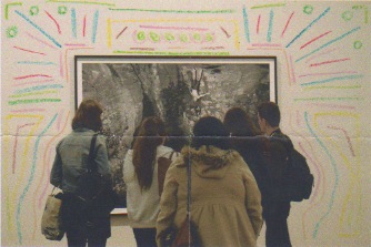
I edited this image using crayons and drawing on the image. I wanted to do this to almost create a tribal appearance to the image, as the group of individuals are all huddled looking at a piece of artwork. I like how this has turned out as the colours are not too bright and blend well with the background. 


Tuesday, 9 February 2016

Work Diary & Progression- 'Stereotypical London' Photo Documentary

Evaluation:

We went on a trip to London and we were given the task of photographing what we wanted to- I chose to focus on photo documentaries. I then took pictures based on 'stereotypical London', and how a daily commuter, or tourist would view London. I liked the freedom what we were given as we could shoot whatever we wanted. 


This is my best photograph of the day, as I like how its run down appearance creates more texture, and contrast in the photograph. This image is unedited, as I do not believe it needs any editing. The glow of the light catches your eye as it's slightly brighter than the rest of the image. This fits into my photo documetary of 'Stereotypical London' as the underground is widely assossciated with London, and you can see the universal sign for this in the image. Line is executed well in this image through the bricks in the background, moreover shape is too executed efficiently as there's various different shapes (rectangles, squares…) 

This is my worst image of the day as I should have adjusted the camera settings, I shot this image on exposure 1/100 seconds, ISO 200, and F/9. This was the wrong settings, as it highlighted the sign in the foreground; whereas, the background is too dark. This is too much of a contrast and it looks unrealistic.  
However, I do like the sky in the image and the colours shown across it. 


Progression:


Tuesday, 2 February 2016

London Photography Trip - Photo Documentary

Whilst being in London, and viewing the exhibitions, I also photographed my surroundings, I decided to include these in a photo documentary about 'London.' I wanted to capture London through the eyes of tourists, and commuters. 

Below are my images which make up my 'Stereotypical London' Photo Documentary:


This is an iconic figure of London (the telephone bow), however what makes this image special is that the colour of the bow is black, not red, therefore this image is significant.

The red postbox is an iconic figure in London life, many tourists associate these with London, I wanted to capture the bright red colour, in order to make it almost 'pop' out of the photograph. 

This image would be a usual sight for a commuter to work. The old lights and tall buildings would be seen daily by them. 

This image creates the sense of chaos, therefore it shows an essential part of London- the business. 

Street art is frequently seen in Trafalgar Square, therefore I had to include this in my series, many tourists will visit London to see the various street acts in Trafalgar square.

The national art gallery is an iconic building centred in Trafalgar square. May tourists will visit here, consequently this is why I included this image in my series. 

This man is a street performer in Trafalgar square, you can frequently see all types of acts here. Many tourists visit Trafalgar square and see these attractions, subsequently I included this in my series of images. 


The lions in Trafalgar square are known world wide, therefore many tourists would have viewed these and want to visit them if they ever came to London, therefore I included this image in my series. 

This is a waterfall in Trafalgar square, with a statue beautifully placed inside. You can frequently see statues like this around London, therefore they're an essential part of London life.

This image shows how London is home to many buildings of an older style. I like how I also captured the red bus, and the iconic lion in the image. Personally, I believe this image shows London life off effectively. 

Red buses are a well known iconic landmark of London, therefore I had to include these in my series. 

This image is of the National Art Gallery at night, I decided to include this as it gives a perspective of what London is like at night. 

This image again highlights what London is like at night, also you can see in the background the London Eye which is a vital landmark in London, along with the London underground sign. 

This image shows what it's like waiting for a train at the London underground, may commuters would like this reality daily, therefore I felt it was important to include this photograph. 

I photographed during the day, and night to reflect the different aspects of London life, when photographing at night I was following in the style of Luxemburg (an artist I had previously researched), as they're photographs of urban landscapes. Moreover, some of these images are photographed at night, similarly to Luxemburg. 


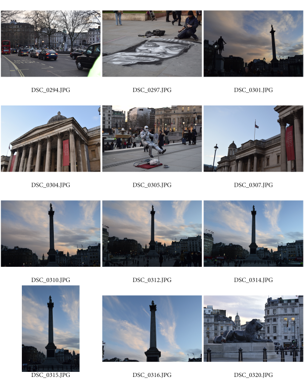
Below are some contact sheets, which show all the images I photographed on the day: