Showing posts with label Editing. Show all posts

Thursday, 3 March 2016

Computer Experiments

Invert-
command J to copy layer
command I to invert image


This changes the image overall, making it appear more spooky than previously as you cannot clearly see the identification of the individual.


Blending-
command J to copy layer 
change the box option from normal to preferred one

In this image I chose the option 'hard light.'
This changes the image by making the colouring stand out brighter, with sharper edges.


Filters-
go to filter gallery, and select preferred one


In this image I used the 'accented edges.'
This changes the image by making the edges illuminate, by doing this is eventuates the edges further.


Liquify-
go to 'filter'
then select liquify


This changes the image, making it almost appear as a fantasy due to the light now looking like a spiders web, due to the edges of it.


Tilt shift-

go to 'filter'
then click on 'blur gallery' 
now click 'tilt shift' 
press command key to help you move the bars


This changes the image by allowing you to focus on the sign itself more.

Burn tool-
To create this image I selected the burn tool along the left hand side of the photoshop page, I then selected what size I wanted the brush in order for it to cover the area I wished, next I clicked on the areas I wanted to darken.

This changes the image dramatically as the colour in the individuals face is extremely enhanced. 

Liquify-
To create this image go to 'filter' along the top bar of the page
then select 'liquifiy'
next edit the image to your satisfaction
click 'done' and the image will change

This changes the image and makes it appear more interesting, as the frames are a unique shape. 

Selective colour-
To create this image I used the quick selection tool to select the area of the sign, once happy with what I selected, I then went to 'select', then 'inverse' so that the background was now selected.
I then edited the image into black and white

This changes the image by causing the viewer to focus more on the station's sign itself, as that is the part highlighted. 

Thursday, 21 January 2016

Fourth Plinth- Straight Images

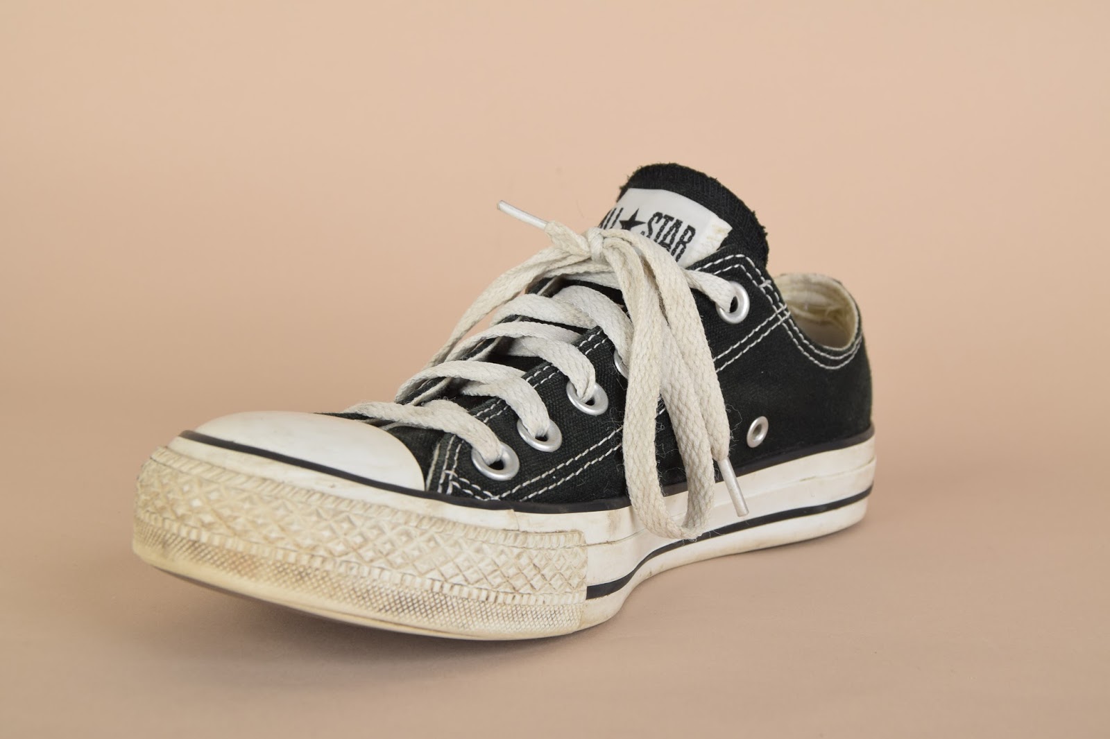
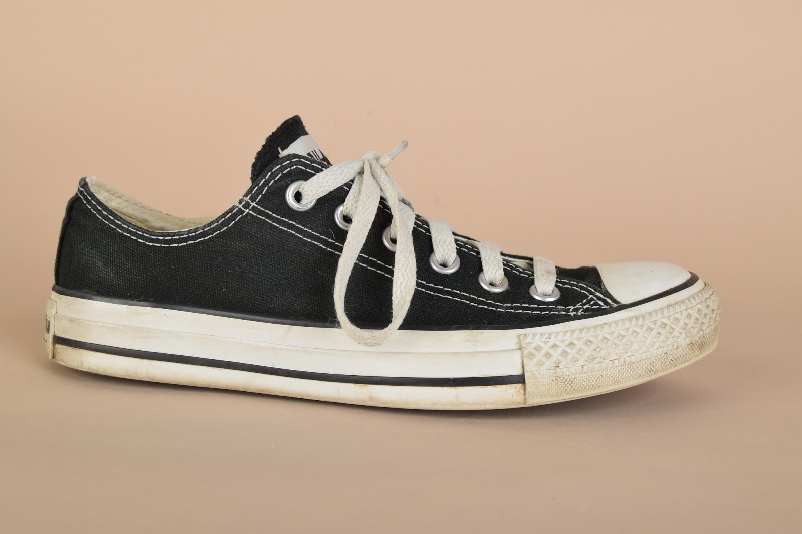
This is my final image, I edited this image on photoshop. I firstly opened up my two images (the shoe, and landscape) on photoshop, I then cut out the shoe from the background using the quick selection tool, I then inverted this, and used the move tool to drag the image of the shoe onto the urban landscape. I then used cmd T to resize the image. After this I used then paint tool to colour the shoe darker, so it would fit in with the darker surroundings, I did this by lowering the opacity, and flow of the brush. Overall I do not like the final image as it looks tacky, I do not like the fourth plinth topic anyway, and would not wish to recreate it again. However, if i was to re-make this image I would ensure the image appeared more realistic overall. The only aspect I like of this image is that the shoe is slightly dirty, which adds to the urban feel of the image. 


This is the original landscape image. 


This is the original image of the shoe. 

I photographed this image on F 9 ,ISO 200 and shutter speed 1/125.


This image was made using the same method as the one above. I prefer this image to the one above as it blends in better overall. This represents the fourth plinth project well as you never see a giant shoe in a local park. If I was to make this image again I would attempt to place the shoe in the water, so it appears to be a boat; this would reflect the fourth plinth well as you never see giant floating shoes. If i was to remake this image i could use a different angle of the shoe, in order to make the image more interesting/make it fit better into the image as a whole. 


This is the original landscape image 

This is the original shoe image. 

I photographed this image on F 9 ,ISO 200 and shutter speed 1/125.


The other images I photographed of the shoe: 


When we went to London I found many objects which complimented the 'fourth plinth' topic well.  They are shown in the following images below:

This object was outside Kensington Station, it represents the  fourth plinth well as you wouldn't usually see a giant bucket full of objects in a street. 

I photographed this image in Trafalgar Square, the lion is the focus of the fourth plinth here.

Again, this image is taken in Trafalgar Square and the lion represents the object for the fourth plinth here.

This object is the official 'fourth plinth' representation in Trafalgar Square, this changes ever few years, giving a variety of artist the chance to win this profound spot. 

This statue I believed could represent the fourth plinth as it's out of the ordinary and unique, it's not something you see everyday. 

This lion again represents the fourth plinth as it's out of the ordinary. I could edit this image and place another strange object over the top of the lion, creating my own fourth plinth image. 

Tuesday, 1 December 2015

Computer Experiments


I used the vignette effect on the image, you cannot see much of a difference as the image was dark originally. If this image was on a white background you would see the vignette better. The image on the left is edited, whereas the image on the right is the original image. I like hope the vignette draws your eye into the face although i would do it on a lighter image in the future, as it would highlight the effect more. 
I created this image by firstly creating a new adjustment layer for curves, then name your layer, after this you must drag the curve down over exaggerating it, as shown below:


 You must ensure the squares at the top are black and white, as seen below:
then click on the gradient tool, and select 'gradient', next click on the radial button:
and then drag out from the centre of the photograph, to create the vignette. 


I edited this image using the white balance effect. I selected the white background and it then transformed the image from warmer oranges to harsher blues. The image on the left is the original, whereas the image on the right is the edited one. I believe the edited image appears better than the non-edited one as it looks almost HD due to the whiter, brighter background.


I edited this image using the spot healing brush tool. I applied it on the facial region, around the forehead and cheek area. This shows a slight difference and makes the skin appear smoother and more glowing, despite this there's not that much of a difference when zoomed out of the image.
You can achieve this affect by selecting the 'healing tool' on the left hand column of the screen, you then click the areas you wish to change. You can change the brush size, and density at the top of the screen.


The image on the right is edited, whereas the image on the left is the original. I used the brightness sand contrast tool to initially up the brightness of the image, then i used sensitive colour to edit the blues in the image. This creates a cool, crisp view overall. I prefer the image on the right (the edited one) as it creates a cleaner image overall. 
The brightness/contrast tool is on the right hand side of the page, you alter this by using the sliders. The sensitive colour tool is also located in the same place, and you select which colour you want to change and enhance this. To achieve the white balance effect, first you must click on the levels button the the right hand side of the screen, as shown below:
next click on the part you wish to balance, and it will change the colour for you. 


The image on the left is the edited one, whereas the one on the right is the original photograph. I believe by editing the image it has made it worse. I used the dodge tool to lighten the face, and the burn tool to darken the top and jacket. I believes it looks worse as due to the different colours on the face, it appears as though the face has darker and lighter patches. Despite this i do prefer using the burn tool on the top and jacket as it highlights the detail and shadows.
To used the dodge tool, you select it on the left hand side of the page. You then click on the parts you wish to lighten. You can change the brush size, and density at the top of the page also. 


The image on the right is the edited one, whereas the image on the left is the original image. I prefer the edited image as it exposes more tone and saturation, which makes the image more interesting. The screen shots adjacent show which settings i had the filters on the image on. 


This is an image I photographed, and then edited into black and white. I believe the black and white effect allows the detail of the bricks to stand out more. Overall I like the image as a whole, as you can also see the shadow casted. 
To achieve this affect you select the 'black and white' tool which is located on the right hand side of the photoshop page. You can then edit the different colours in the image, using the sliders, which change how dark/light some areas are.