Evaluation:
In today's lesson I investigated urban landscape in the style of Luxembourg. I enjoyed this shoot as it allowed me to photograph run down areas and bring out their rough textures.
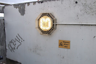
This is my best image i photographed of the day. The image above is the edited one, whereas the image below is the original photo. I believe in this image I have captured urban life; this is because the graffiti implies that the area is run down, and uncared for. In addition to this the peeling paint again implies that the building is, again, uncared for. The light is a dim yellow-orange which suggests it's dirty as it is not pure white. Shape is explored well in this photograph as the light has an usual shape guard around it. Moreover, texture is also shown effectively as the paint on the wall appears flakey (top left), and mouldy (top right.)
This is my worst image of the day. I have not got any depth in the photo, in addition the graffiti is extremely hard to see due to the white background being over exposed in my image- therefore i believe there's not enough detail in this image, making it boring. If i was to shoot this again i would take the photo from a different angle, getting down lower in an attempt to create some depth. Furthermore, I would then attempt to photograph the wall closer in an attempt to get more of the detail from the graffiti in.
Progression:


No comments:
Post a Comment