Friday, 29 January 2016

Connecting Essays

Connecting Essays-

This is an image I found on the internet, this image highlights the use of lines and shape well. I like the angle in which the image is photographed, as it makes the bike appear 2D, and flat. Furthermore, the angle of the image allows a different perspective of the usual 3D bike. The black and white aspect of the image highlights the contrast in colour of the bricks behind. Concentration is held on the bike itself, you're not distracted by the background of the image which is what I believe the photographer intended. An urban feel is given in this image from the bricks in the background, as it appears to be in a city centre. 


These are my images I photographed in the college. I edited the image on photoshop (the bigger image is the edited one), I edited the image and gave it a warmer colour as I believe it makes it seem more autumnal. This is due to the warm brown/orange colours. In this image I believe I have made the bike appear 3D, as tone is shown through the shine on the bike, allowing you to see the poles curve and that it is not a 2D image. Your eyes focus on the bike, as I have positioned it in the centre of the image. I photographed this image at a slight diagonal angle to capture the 3D aspect more.


Overall, these images link as they're both images of bikes which suggest adventure and travel. The image from the internet has a plain background (bricks), whereas my image has more of an open background as you can see pavement, trees and fences. Although the angles of the images may vary, you can evidently observe how the two images link, as they're both photographs of the same object. Moreover, focus is drawn to the bike in both the images, not to any other background objects. 


Wednesday, 27 January 2016

Connecting Essays

Connecting Essay- 


 This image is one I found on the internet, it is a photograph of leaves with raindrops on them. The raindrops are captured as they're falling down the leaf. This image implies it was taken in summer, as the leaves are ripe green. In the raindrops on the leaves you can observe the reflections of the environment around the leaves. In addition the shape of the leaves gives a symmetrical pattern to the image. 


These images are my photographs, I took them in the college grounds. I photographed this image on a dull, rainy day. I converted the image into black and white as I believe it captures more of the detail, it also makes the water appear as ink running down the leaves. 

These two images link together well as they're both photographs of leaves, in addition they both have rain drops on the leaves. Furthermore, my image and the internet one have both been photographed at similar angles, despite the image from the internet being photographed at a closer range, in comparison to my image. Both of these image highlight shape, and pattern as the leaves are symmetrical. 

Connecting Essay

Connecting Essay-

                                                                                                                       This image is one I found on the internet which is similar to my image below. In this image the photographer has made it appear as though the girl who is holding the mirror is also turning around in the image- this is an illusion. Due to the image being black and white it gives the image a slightly spooky appeal as she appears to have her head bowed, either in sadness or anger. Therefore, this leaves you questioning- why?


This image is the original photograph I took, before I photoshopped the body onto the mirror.
In this image it appears as though Jasmine is holding up a mirror with a reflection of herself in this; however, this is impossible as she is behind the mirror holding it up, this is an illusion. The facial area in this photograph is slightly overexposed, this is due to my camera settings, and the lighting in the studio. I used photoshop to create this image by cropping the original image I photographed of Jasmine's body, and then dragging it over onto this image, I then used cmd T to resize this image, and dragged this to the correct size. Overall, I like this image as it looks legitimate, however I would ensure Jasmine held the mirror straight next time, as the frame is slightly wonky, therefore it was hard for me to get the image to the correct size, to fit into the gap available. 


Overall, I believe the two different images link as they are both using deception. This is evident through how we have both used mirrors, which reflect the individual who is thought to be behind them, holding them. Our technique varies as my image is taken inside, in a studio, whereas the above image is photographed outside. Due to the over-exposure of my image it appears to also be slightly spooky, corresponding with the linking image, my image is spooky as the over-exposure makes it hard observe Jasmine's facial expression. 

Tuesday, 26 January 2016

Connecting Essay

Connecting Essays- 


This image is photographed as a portrait using low key lighting. The photographer has made the girl look down in the lens, drawing your eyes into hers, and into the image. Her dark eye liner also draws your eyes into hers, as you focus on the tiny flicks either side of her eyes. Her hands slightly obstruct your view to part of her face. Overall I like this image, as one side of her face is bright, whereas the other side is darker.  


 This is my image I photographed in our college studio. I used the low key lighting to photograph this image. The person in my image is looking slightly to the right of the camera lens. This image was based on Irving Penn. Here, I have captured a dead pan look, with no emotions being shown. I decided to edit the image black and white as it highlights the lighting aspect in more detail, in comparison to the coloured image.


I believe these two images are linked as they both capture low key lighting. Although the other image has less low key lighting than my image, they still both portray it in various ways. Both the images are in black and white, which highlight the contrasting colours in the image, and the detail. 

Connecting Essay

Connecting Essay-

This is an photograph of the Alcoa building in Pittsburg. The glass on this building is design to reflect the motion of the river it is situated next to (the Allegheny river.) In this image I admire how the curved lines act as leading lines, taking your eye on a journey into the image. The black and white colour aspect adds more contrast to the image, and detail, as your eyes are not distracted. This image has a structured appeal to it, giving it shape and organisation. 


These images are photographed by me. This image is of a building opposite my college. This image givens an urban feel, much like the image above, and is likewise of a building. In my image I like how I captured a wide depth of field, also I decided to make the image black and white as it captures more detail, and shows more of the contrasts within the image than the coloured image does. 


The two photographs are linked due to their urban/city appeal, they're also both photographs of buildings. Moreover, the black and white aspect highlights the contrasting colours more. The fact both the images are structures implies we all need structure in our lives, even through all the business we occur daily. Our technical techniques are also similar as we have both photographed our images from and angle, (the side of the building.)


Thursday, 21 January 2016

Landscape Homework - Straight Images


Fourth Plinth- Straight Images

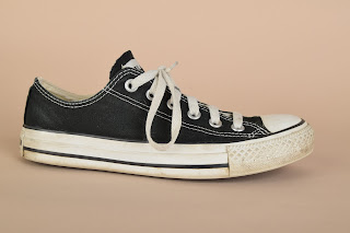
This is my final image, I edited this image on photoshop. I firstly opened up my two images (the shoe, and landscape) on photoshop, I then cut out the shoe from the background using the quick selection tool, I then inverted this, and used the move tool to drag the image of the shoe onto the urban landscape. I then used cmd T to resize the image. After this I used then paint tool to colour the shoe darker, so it would fit in with the darker surroundings, I did this by lowering the opacity, and flow of the brush. Overall I do not like the final image as it looks tacky, I do not like the fourth plinth topic anyway, and would not wish to recreate it again. However, if i was to re-make this image I would ensure the image appeared more realistic overall. The only aspect I like of this image is that the shoe is slightly dirty, which adds to the urban feel of the image. 


This is the original landscape image. 


This is the original image of the shoe. 

I photographed this image on F 9 ,ISO 200 and shutter speed 1/125.


This image was made using the same method as the one above. I prefer this image to the one above as it blends in better overall. This represents the fourth plinth project well as you never see a giant shoe in a local park. If I was to make this image again I would attempt to place the shoe in the water, so it appears to be a boat; this would reflect the fourth plinth well as you never see giant floating shoes. If i was to remake this image i could use a different angle of the shoe, in order to make the image more interesting/make it fit better into the image as a whole. 


This is the original landscape image 

This is the original shoe image. 

I photographed this image on F 9 ,ISO 200 and shutter speed 1/125.


The other images I photographed of the shoe: 


When we went to London I found many objects which complimented the 'fourth plinth' topic well.  They are shown in the following images below:

This object was outside Kensington Station, it represents the  fourth plinth well as you wouldn't usually see a giant bucket full of objects in a street. 

I photographed this image in Trafalgar Square, the lion is the focus of the fourth plinth here.

Again, this image is taken in Trafalgar Square and the lion represents the object for the fourth plinth here.

This object is the official 'fourth plinth' representation in Trafalgar Square, this changes ever few years, giving a variety of artist the chance to win this profound spot. 

This statue I believed could represent the fourth plinth as it's out of the ordinary and unique, it's not something you see everyday. 

This lion again represents the fourth plinth as it's out of the ordinary. I could edit this image and place another strange object over the top of the lion, creating my own fourth plinth image. 

Tuesday, 19 January 2016

Fourth Plinth - Definition Post

Ideas for the fourth plinth:

  • Dinosaur
  • Converse
  • Glasses
  • Shoes
  • Watch 
  • Bus
  • Teddy 
  • Chicken
  • Flowers 
  • Bus

The fourth plinth is when an object appears to be in an ambiguous situation/somewhere it shouldn't. The fourth plinth is situated in Trafalgar Square, London. It is a rolling programme of temporary sculptures, rather than having merely one figure. There's a plinth in each 4 corners in Trafalgar Square. 


Cedric Delsaux:

Cedric was born in 1974. He was first known for his advertising campaigns. He attempts to combine reality with fiction, as apparent in the following star wars based images below.  


The image on the left combines reality with fiction, as the characters placed around, and on, the car are fictional. This image is a mixture of different beiges, reflecting the dusty texture of the environment. I do not like the forth plinth, however in this instance i do like it, as it is realistic and doesn't look completely artificial. 


This image is realistic, the red of the light saver completely contrasts the black, dull colours surrounding it, this draws your eye into the image, allowing you to have a focal point. This image appears to be a still from an action movie, and it extremely believable. 


This urban-style image is captivating, as in the background you can see buildings, implying you're in London, however in the foreground the giant alien-like ship contrasts this and creates an industrialised appeal. The dim lights also imply there's a 'secretive' feel about it, creating intimacy within the image. 


Thursday, 14 January 2016

Work Diary & Progression - Urban Landscape

Evaluation:

In today's lesson I investigated urban landscape in the style of Luxembourg. I enjoyed this shoot as it allowed me to photograph run down areas and bring out their rough textures. 

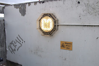
This is my best image i photographed of the day. The image above is the edited one, whereas the image below is the original photo. I believe in this image I have captured urban life; this is because the graffiti implies that the area is run down, and uncared for. In addition to this the peeling paint again implies that the building is, again, uncared for.  The light is a dim yellow-orange which suggests it's dirty as it is not pure white. Shape is explored well in this photograph as the light has an usual shape guard around it. Moreover, texture is also shown effectively as the paint on the wall appears flakey (top left), and mouldy (top right.)


This is my worst image of the day. I have not got any depth in the photo, in addition the graffiti is extremely hard to see due to the white background being over exposed in my image- therefore i believe there's not enough detail in this image, making it boring. If i was to shoot this again i would take the photo from a different angle, getting down lower in an attempt to create some depth. Furthermore, I would then attempt to photograph the wall closer in an attempt to get more of the detail from the graffiti in.  

Progression: