Tuesday, 3 May 2016

Documentary Photography- Definitions Post


      Documentary photography- 'usually refers to a popular form of photography used to chronicle events or environments both significant and relevant to history and historical events and everyday life.'

      Adjectives & Synonyms for 'documentary' :
    • broadcast
    • film
    • recent
    • short
    • hours
    • informational
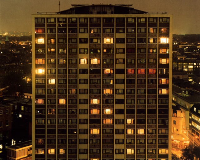
    All of the below images are dark documentary images, even though they're not all from the same photographer you could say they all link. However they are not linked directly. All of the images are in black and white, which implies a dark atmosphere in the images as a whole; therefore we can gather they're all not about a particularly uplifting topic. 

    This is an image of a factory worker, it appears as though he is working in poor conditions, and we therefore conclude he doesn't get very good money due to the state of the factory. This creates sympathy in us as a viewer.

    This image is extremely moving, and ambiguous as we do not know what the man is hunting; whether it be humans or animals. The fact he is in water implies he is desperate to catch whatever he is aiming for, otherwise he would not go to such extreme lengths. 

    This image again creates sympathy in us as viewers, as we do not know if the woman will die or not. In addition, what makes this image interesting is the fact that the two individuals are walking behind, glancing at the woman as if this is normality-this again shows ambiguity as we do not know where or why this is happening. The smoke in the background again adds a dramatic effect. 

    This image creates huge empathy in the viewer. As the photograph is of a child it adds to the emotional aspect of the photograph. It is evident the boy has a skin problem, as we can see the texture of his skin, and how rough it is. 

    my own definition:- a series of images which link to an overall title. 

    Formal Elements Mindmap

    Final Evaluation

    I believe the photographer research I conducted influenced me when taking my photographs. Rut Blees Luxembourg is one example of this, she influenced me when photographing my 'urban photography' as shown in the images below. Luxembourg influenced me, as from her image I then decided to photograph a block of flats too, although the flats in my image are much narrower, and photographed during the day, it's evident how she influenced me as my image, and his are photographed at the same angle. 

     (Luxembourg's work)
     (my work)

    Another photographer whom I researched who inspired me was Irving Penn. Irving influenced me when I was focusing on the topic of 'low key lighting', below is an example of my work, and Penn's. Penn's use of lighting influenced me, and challenged me to try different aspects of lighting in my photographs, including both high and low key lighting. In the image below both mine and Penn's work highlight the use of low key lighting. 

    (Penn's work)
     (my work)

    I have learned a variety of techniques through out this unit which have all contributed to my photographic skills. I have understood how changing my shutter speed will affect the focus on the image, and how changing my aperture will allow me to create either a wide or narrow depth of field, as shown below:

    This image demonstrates how I now understand how changing the shutter speed can affect the focus of an image, as you can see, the individual is in focus, but the umbrella is blurred. 
     This is my image and it shows a narrow depth of field, this was photographed on a low aperture. 

    This is my image, and it shows a wide depth of field, this was photographed on a high aperture. 


    During this unit I have also learned how lighting in the studio can affect my images, and possibly result in my subjects being overexposed, or too dark. I have learned over the year how to control this better, and how equipment such as snoots, and honeycombs can help vary my lighting, allowing me to control the direction, and width of the beam of light. Furthermore, I learned how to set up the studio, during my topic of 'low key lighting'.


    These two images are examples from early on in the year, when I hadn't perfected my lighting techniques, I had the reflector dish too close, and this resulted in the right hand side of the face being over exposed. 


    Whereas, this image is not overexposed at all, I had got the lighting correct here, as all of the face is in focus. Moreover, the image is not too dark, or too overexposed, it's just right. 


    I believe the way in which I photograph has dramatically improved over this unit, as shown in the images below.

     I photographed this image when we were focusing on the formal element 'shape.' I was literally focusing on obtaining images of various, interesting shapes; therefore at this point I was not thinking about shadowing, angles, lighting... I believe this image is very weak as it's merely of a wooden wall corner. I was also using a camera which wasn't my own, but the colleges, therefore I'd never used this before, and I did not yet feel comfortable adjusting the camera settings. I don't believe this image really portrays shape to the best of it's ability.


    This image I photographed later on in the unit, when we were set the task of photographing landscapes for homework. I went out in my local town, with my own camera, which I'd had for a while by now, and I was much more comfortable with changing the camera settings, and taking into consideration: lighting, shadowing, angles... I believe this image is a considerable amount better than the one above as the arches are caught at a good angle, showing the depth behind, moreover the colours I captured work well within the image, unlike the image above which is a mixture of grey's, greens browns... 


    Through-out this unit I have varied my editing techniques through both computer experiments, and physical experiments, in order to try and achieve the best effect/ outcome for my photograph. I extremely enjoyed editing my images, as on the computer you can essentially change your image to anything you want it to be. In addition, through the use of physical experiments it allowed me to be more hands-on and edit my images using various techniques, like drawing on them, scratching them, screwing them up... I would then scan my physical experiments onto the computer. 

    Below are some examples of both my computer, and physical experiments: 


    I photographed this image when we went on a trip to London, it features as part of my photo documentary. I edited this image using the selective colour technique; to do this I used the magic wand tool to select all parts of the image I wanted in colour, once I was content with what I selected I then clicked 'select', 'inverse' which then selected all other parts of the image. Next, I then edited these into black and white. I like the outcome as the dark, royal blue stands out from the grey, and black of the background. 

    I photographed this image as part of my portraiture topic. I then edited this image physically. I did this by printing it out, and then using the ends of scissors to scratch away the ink from the image, leaving white scratch marks. The outcome of this image is effective as it adds to the atmosphere of the photograph, by making it appear sinister, due to the fact it appears as though the individual's eyes are gone. 

    I photographed this image when focusing on the topic 'reflection', I made this image by firstly taking a photograph of the girl, without her holding the mirror. I then took a photograph of the girl holding the mirror. Once I had the tow images, I then edited them together to create the image as shown on the left. I believe this image has come out effectively. It appears spooky because she is holding a mirror, yet she is in the reflection too which is impossible. The fact the image is slightly overexposed adds to the effect, as it makes her appear ghostly. This is why I like varying my editing techniques as you can make the impossible, possible.

    I believe that over this unit, we haven't been able to work freely, due to us focusing on specific elements and how to show them alone in our images. I'm hoping that in our next component we will be given more freedom, allowing me to develop along my own preference of photography, resulting in me developing more as a photographer as a whole. Although, I do believe that when focusing on the elements, my work elicits a form of compositional photography as I often guided the viewer's eye towards the important elements of my work (colour/shape/line/tone...) My work was not abstract at all, due to the fact our images had to portray certain elements, hopefully in our next unit I could perhaps try a more abstract route when taking my photographs too. 


    There were a variety of areas in my work where success, and failure came. I enjoyed shooting 'documentary photography' best as this area allowed me to focus on whatever topic I liked, and photograph pictures around this- I gained more freedom in this topic. However, I feel like my weaknesses came when focusing on the formal elements, as these were more structured lessons, with lower freedom allowance, due to us focusing on specific elements. In particular, I found both tone, and form particularly hard to photograph, this resulted in my pictures in these elements being the weakest.

    Below are some examples:


    This image I photographed during our trip to London, when I was focusing on documentary photography. I like this image as the dull, and dirty bricks contrast the colours of the London underground sign, the light, and the advertisement. The London underground is a trademark of London, therefore I had to capture this somehow in my documentary. I didn't want to stereotypical photograph just the sign, so I then decided to capture the platform as a whole. I believe my camera settings are perfect here, as the lighting is just right, as I have really captured the texture of the bricks themselves. Additionally, my aperture works well, as it's allowed me to obtain a wide depth of field. 

    This image I again photographed during our trip to London, when I was focused on documentary photography. I like this image as the telephone box is a typical object seen in London; however, this phone box is different as it's black, not the usual, and expected red. Moreover, I only photographed the top of the phone box, in order to focus on the word' telephone' which is outlined in a white box, contrasting the black backdrop. My camera settings are effective here, as there's just the right amount of light being allowed into my camera lens. Moreover, the aperture setting allowed me to focus on all of the details in the image, not just the words 'TELEPHONE'. 


    I photographed this image as an example of 'tone', I believe this image is extremely weak as it doesn't show its clear purpose. Although there are light and dark areas, it's not a photograph of an interesting scene/object, it's merely a photograph of a cluttered windowsill. The only part of the image I like is the blinds, as the light, and dark colours work effectively here in order to highlight tone.
    This image was photographed in an attempt to show 'form', I believe this image fails at this as form should be shown a lot clearly than this, perhaps if I'd have worked in the studio then I could have achieved this easier, as it was a bright day when we photographed this element. The shadows also ruin the image as they come in at an angle. This image as a whole is not technically executed well, and should have portrayed 'form' clearer. 

    Thursday, 21 April 2016

    Joiners - Work Diary & Progression

    Evaluation:

    In this lesson we were given the task of making a composite; this meant we had to photograph objects, or people and create a big image, using lots of smaller ones. This was interesting as it was something different to do, as we used photoshop a lot more when creating these joiner images. We could create our joiners using objects, or people. 

    A photo I like:


    I like this image as the edges of the stairs are still almost straight lines, therefore the image is not too abstract but you can tell it has clearly been edited. I like the different colours of the stairs, where some are darker and others are lighter, from the different angles I photographed them at. 


    A photo I don't like:


    I do not like this image as one of the squares are a different colour to the rest of the red squares. Furthermore, there's gaps in the image. To avoid this I could have photographed more images in order to bulk out the image and prevent there from being gaps. 


    Progression:
    I found it quite hard to actually join the images together themselves, as I didn't want them to appear too abstract, or too neat. This was an issue as I therefore didn't complete many as they took me a long time. If I was to recreate these images then I would vary my tone, colour (black and white) to vary my images further. 


    Thursday, 24 March 2016

    Thursday, 3 March 2016

    Computer Experiments

    Invert-
    command J to copy layer
    command I to invert image


    This changes the image overall, making it appear more spooky than previously as you cannot clearly see the identification of the individual.


    Blending-
    command J to copy layer 
    change the box option from normal to preferred one

    In this image I chose the option 'hard light.'
    This changes the image by making the colouring stand out brighter, with sharper edges.


    Filters-
    go to filter gallery, and select preferred one


    In this image I used the 'accented edges.'
    This changes the image by making the edges illuminate, by doing this is eventuates the edges further.


    Liquify-
    go to 'filter'
    then select liquify


    This changes the image, making it almost appear as a fantasy due to the light now looking like a spiders web, due to the edges of it.


    Tilt shift-

    go to 'filter'
    then click on 'blur gallery' 
    now click 'tilt shift' 
    press command key to help you move the bars


    This changes the image by allowing you to focus on the sign itself more.

    Burn tool-
    To create this image I selected the burn tool along the left hand side of the photoshop page, I then selected what size I wanted the brush in order for it to cover the area I wished, next I clicked on the areas I wanted to darken.

    This changes the image dramatically as the colour in the individuals face is extremely enhanced. 

    Liquify-
    To create this image go to 'filter' along the top bar of the page
    then select 'liquifiy'
    next edit the image to your satisfaction
    click 'done' and the image will change

    This changes the image and makes it appear more interesting, as the frames are a unique shape. 

    Selective colour-
    To create this image I used the quick selection tool to select the area of the sign, once happy with what I selected, I then went to 'select', then 'inverse' so that the background was now selected.
    I then edited the image into black and white

    This changes the image by causing the viewer to focus more on the station's sign itself, as that is the part highlighted.