Tuesday, 10 May 2016

Portraiture low key lighting - Definition Post

High key lighting is an image with predominant light tones, often used in beauty, and low key lighting is an image with predominant dark tones, implying strength and power. High key lighting is often associated with females, whereas low key lighting is often associated with males. 


Snoot-this object allows you to control the lightings direction, and radius. They can help isolate the individual, when using flash in the studio. 


Honeycomb-allows you to tighten the beam of light, it doesn't create an as intense beam of light like the snoot does.


Reflector dish-this allows the light to reflect back onto the subject. It covers the flash head, and allows the redirection of light.


Irving Pen:

Irving pen uses both high, and low key lighting in his images, he uses the above pieces of equipment to achieve this. He was well known for his established fashion photography, and portraiture. Pen was also one of the first photographers to present his subjects on a grey background. Its's evident below how he would base his lighting techniques on the gender of the individual, with low key lighting often being used for males, and high key lighting for females. 


These images below both highlight high key lighting, it is interesting to see that both of these images are of females, this is due to the high key lighting expressing femininity. 

The high key lighting used helps capture the vast amount of freckles on the individuals face, this adds detail to the image.

The image above was one of Pen's fashion shoots, we can see this by the 'VOGUE' logo in the bottom right corner, therefore he would have used the high key lighting as this lighting technique often used in beauty images, in order to portray femininity and to capture all of the details within the image. 


These images below are both examples of Irving's work, showing low key lighting. It is interesting that both these images below are of males, this may be due to the darker tones linking to masculinity.
This image uses low key lighting, the expression held on the mans face works well with the lighting technique as he looks sad, therefore the darker tones in the image portray this further. 

The man appears shocked in this image, as he has wide eyes. The low key lighting adds to the atmosphere of the photograph, by making it mysterious as you cannot see all of the image. 


Work diary & Progression - Documentrary photography - Christmas

Evaluation:

The task was for us to photograph a topic of our choice over our Christmas break, I chose to focus on Christmas itself. I portrayed these images in a photo documentary. I found it hard to photograph things, as there was mainly decorations and lights around, and that was it. Therefore I believe many of my images are quite similar, however they are meant to link as a series, so I have achieved this fully. 

A photograph I liked:


I like this image as the focus from my camera is on the Christmas tree ornament. Christmas trees are one of the main symbols/landmarks of Christmas, therefore I believe this works effectively within my documentary. Moreover, the bright colours of reds, and greens and commonly known festive colours, which again in themselves portray Christmas, and the Christmas spirit. 


A photograph I did not like:


I do not like the above image as the lights are slightly blurry, and not crisp. Although, you can link the decorative lights to Christmas, this is not too obvious and therefore I wouldn't say it completely elicits what I want it to. If I was to re shoot this image again I would ensure my camera settings were correct in order to avoid the blur. To do this I should make my aperture higher, and make my shutter speed quicker. 

Progression:

If I was to re shoot again I would take a more abstract approach towards Christmas, and not focus on obvious, stand-out objects like decorations. I would focus more on the 'family' aspects and 'unity'. Although, I do believe some of my images of decorations were effective, and if I was to re shoot these I would perhaps choose a narrower depth of field, in order to vary my techniques. 


Thursday, 5 May 2016

Low Key Lighting - Image Bank

I like this image as you cannot see the face of the individual, only the outline which allows us to gather that the individual is a male. This image creates ambiguity and this inspires me to try this in my photographs. 

This photograph is interesting as it creates low key lighting on an animal not a human. The lighting helps create a masculine appearance to the image, where as high key lighting creates a more feminin appearance. The lighting helps create a menacing ambiance which adds to the atmosphere of the image, enhancing the cats stare. 

The above image is interesting as the image is of a female, where usually high key lighting is used; however, low key lighting is used in this image, meaning that you cannot see half of the females face, this creates a mysterious atmosphere.

The above image creates ambiguity as you can only see half of the mans face. The man in the image is looking downwards, appearing as though he is disappointed. This leads us to question as to why he may possibly be feeling this way. I would like to try and recreate this mood in some of my images.

This photograph is of a female, again you can only see half of her face, and she is looking directly at the camera, in contrast with the images above whereby the subjects are not looking into the camera. She is also holding something over her head, suggesting she is hiding from something. 

This image contrasts the ones above it as it is of several people, not just one person. The lighting hits all their faces the same, apart from the first and last individuals, where the first individual's face is darker than the last individuals.

Low Key Lighting - Definition Post

Low key lighting is a style of photography whereby you use lighting to your advantage in order to create a dark photograph, with light reflecting slightly off the other side of the individuals face (a reflector helps to achieve this.) It helps enhance the contours of an object. This effect is commonly used in horror films, as it aids in alienating the viewer.

Low key lighting is used in:
  • fashion
  • film
  • media
  • television
  • magazines

Here is an example of where low key lighting is used in a film:

As you can see there's many shadows cast over the image, which create a sense of mystery. The low key lighting helps create a chiaroscuro effect. 


Here is an example of low key lighting being used not on people, but objects:

This image is different to usual images of low key lighting, as it's of food objects, not individuals. 


Below are various ways in which you can set up the studio in order to achieve a low key lighting effect:


This is how the studio will be set up in order to achieve the low key lighting effect. 

Image Manipulation - Image Bank

I like this image, as it takes an everyday activity and makes it unique. It's also an interesting image as the elephant is actually winning the race, when we'd assume that it would be last- this adds to the abstract qualities of this image. The colours in this image also work well together as the dusty browns contrast with the clear blue sky.

This image makes the sea of houses below, almost appear as a carpet, or a wave, rising up into the air. I would like to create something similar to this; however, I do not know how I would photograph a town from that high in the sky.

This image is inspiriting as it takes an ordinary human, and makes then appear unnatural. It almost takes the literal meaning of 'knot in my stomach' and makes it a reality. I could attempt to recreate this image in the studio. 

This image is strange as the mans face appears to be a book, with numerous pages. This image is extremely unique and abstract, which makes it interesting and easy to view. The muted colours in the image also work effectively. 

This image is inspiring as it's ironic and humorous, as the watermelon actually has become a 'water' melon, with a fish in it too, again adding to the humour. 

This image is abstract, as you'd assume the glass would break and not the hammer, it's  portraying a role reverse. 

Image Manipulation - Work Diary & Progression

Evaluation:

In today's lesson we were given the task of editing objects, into other images. I did not photograph any of the images below, I go them off of the internet. I was merely trying to improve my editing skills, not my literal photographing skills during these topic. I enjoyed this topic, as it allowed me to work freely on Photoshop, editing various objects into any landscapes I want. I went with the idea of animals in their habitats. 


An image I like:
I like how I've edited this image as I used the burn tool to make the two animals which I edited into the image (foxes) darker, so they would blend into the image, and not stand out due to their brightness. This image looks extremely realistic and doesn't look edited at all. 


An image I do not like:


I do like this image, however I believe it is the weakest link out of the two, as I should have edited the image so the sunlight hit the right side of the lion, not the left, this would have made the image more realistic, and believable. Moreover, the zebra stands out too much, I should have used the burn tool in order to darken the animal, to allow it to  fit into the image better. 


Progression: 

Instead of just placing animals into the image I'd like to manipulate and combine images, in order to vary and expand my techniques. 


Fourth Plinth - Work Diary & Progression

Evaluation: 

We were given the task of editing images into other photographs we'd taken, in order to imitate a 'fourth plinth', we had to work primarily on photoshop to do this. I enjoyed this task as it allowed me to further my skills on my editing in photoshop. I photographed objects in the studio, and edited these onto the images I took during my landscape homework. I wanted to make my images surreal, and ensure that they blended well within the image.


An image I liked:

I liked this image as it is extremely abstract and fits the fourth plinth theme, as you do not see large shoes in landscapes. I also like how I edited the shoe in order for it not to stand out greatly from the image, as it was originally extremely light, and didn't blend well- it now looks realistic. If I progressed this further I could have then reflected the shoe in the water, to make this image appear more realistic. 


An image I did not like:

I believe this image was the weaker one out of the two, as the shoe appears stretched and edited. Moreover, despite it being an unusually large shoe, it fits in better with the environment, than it does in my best image above. Therefore, this does not hit the fourth plinth criteria, as it has to be an object that stands out, and would not appear to usually fit into the environment. I could have also created a reflection of the shoe in the puddle which would have enhanced my image as a whole.


Progression:

If developed I'd like to try experimenting with different objects, in order to vary my fourth plinth ideas. Some of the f these objects I could further experiment with are shown below. 


Tuesday, 3 May 2016

Documentary Photography- Definitions Post


      Documentary photography- 'usually refers to a popular form of photography used to chronicle events or environments both significant and relevant to history and historical events and everyday life.'

      Adjectives & Synonyms for 'documentary' :
    • broadcast
    • film
    • recent
    • short
    • hours
    • informational
    All of the below images are dark documentary images, even though they're not all from the same photographer you could say they all link. However they are not linked directly. All of the images are in black and white, which implies a dark atmosphere in the images as a whole; therefore we can gather they're all not about a particularly uplifting topic. 

    This is an image of a factory worker, it appears as though he is working in poor conditions, and we therefore conclude he doesn't get very good money due to the state of the factory. This creates sympathy in us as a viewer.

    This image is extremely moving, and ambiguous as we do not know what the man is hunting; whether it be humans or animals. The fact he is in water implies he is desperate to catch whatever he is aiming for, otherwise he would not go to such extreme lengths. 

    This image again creates sympathy in us as viewers, as we do not know if the woman will die or not. In addition, what makes this image interesting is the fact that the two individuals are walking behind, glancing at the woman as if this is normality-this again shows ambiguity as we do not know where or why this is happening. The smoke in the background again adds a dramatic effect. 

    This image creates huge empathy in the viewer. As the photograph is of a child it adds to the emotional aspect of the photograph. It is evident the boy has a skin problem, as we can see the texture of his skin, and how rough it is. 

    my own definition:- a series of images which link to an overall title. 

    Formal Elements Mindmap

    Final Evaluation

    I believe the photographer research I conducted influenced me when taking my photographs. Rut Blees Luxembourg is one example of this, she influenced me when photographing my 'urban photography' as shown in the images below. Luxembourg influenced me, as from her image I then decided to photograph a block of flats too, although the flats in my image are much narrower, and photographed during the day, it's evident how she influenced me as my image, and his are photographed at the same angle. 

     (Luxembourg's work)
     (my work)

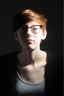
    Another photographer whom I researched who inspired me was Irving Penn. Irving influenced me when I was focusing on the topic of 'low key lighting', below is an example of my work, and Penn's. Penn's use of lighting influenced me, and challenged me to try different aspects of lighting in my photographs, including both high and low key lighting. In the image below both mine and Penn's work highlight the use of low key lighting. 

    (Penn's work)
     (my work)

    I have learned a variety of techniques through out this unit which have all contributed to my photographic skills. I have understood how changing my shutter speed will affect the focus on the image, and how changing my aperture will allow me to create either a wide or narrow depth of field, as shown below:

    This image demonstrates how I now understand how changing the shutter speed can affect the focus of an image, as you can see, the individual is in focus, but the umbrella is blurred. 
     This is my image and it shows a narrow depth of field, this was photographed on a low aperture. 

    This is my image, and it shows a wide depth of field, this was photographed on a high aperture. 


    During this unit I have also learned how lighting in the studio can affect my images, and possibly result in my subjects being overexposed, or too dark. I have learned over the year how to control this better, and how equipment such as snoots, and honeycombs can help vary my lighting, allowing me to control the direction, and width of the beam of light. Furthermore, I learned how to set up the studio, during my topic of 'low key lighting'.


    These two images are examples from early on in the year, when I hadn't perfected my lighting techniques, I had the reflector dish too close, and this resulted in the right hand side of the face being over exposed. 


    Whereas, this image is not overexposed at all, I had got the lighting correct here, as all of the face is in focus. Moreover, the image is not too dark, or too overexposed, it's just right. 


    I believe the way in which I photograph has dramatically improved over this unit, as shown in the images below.

     I photographed this image when we were focusing on the formal element 'shape.' I was literally focusing on obtaining images of various, interesting shapes; therefore at this point I was not thinking about shadowing, angles, lighting... I believe this image is very weak as it's merely of a wooden wall corner. I was also using a camera which wasn't my own, but the colleges, therefore I'd never used this before, and I did not yet feel comfortable adjusting the camera settings. I don't believe this image really portrays shape to the best of it's ability.


    This image I photographed later on in the unit, when we were set the task of photographing landscapes for homework. I went out in my local town, with my own camera, which I'd had for a while by now, and I was much more comfortable with changing the camera settings, and taking into consideration: lighting, shadowing, angles... I believe this image is a considerable amount better than the one above as the arches are caught at a good angle, showing the depth behind, moreover the colours I captured work well within the image, unlike the image above which is a mixture of grey's, greens browns... 


    Through-out this unit I have varied my editing techniques through both computer experiments, and physical experiments, in order to try and achieve the best effect/ outcome for my photograph. I extremely enjoyed editing my images, as on the computer you can essentially change your image to anything you want it to be. In addition, through the use of physical experiments it allowed me to be more hands-on and edit my images using various techniques, like drawing on them, scratching them, screwing them up... I would then scan my physical experiments onto the computer. 

    Below are some examples of both my computer, and physical experiments: 


    I photographed this image when we went on a trip to London, it features as part of my photo documentary. I edited this image using the selective colour technique; to do this I used the magic wand tool to select all parts of the image I wanted in colour, once I was content with what I selected I then clicked 'select', 'inverse' which then selected all other parts of the image. Next, I then edited these into black and white. I like the outcome as the dark, royal blue stands out from the grey, and black of the background. 

    I photographed this image as part of my portraiture topic. I then edited this image physically. I did this by printing it out, and then using the ends of scissors to scratch away the ink from the image, leaving white scratch marks. The outcome of this image is effective as it adds to the atmosphere of the photograph, by making it appear sinister, due to the fact it appears as though the individual's eyes are gone. 

    I photographed this image when focusing on the topic 'reflection', I made this image by firstly taking a photograph of the girl, without her holding the mirror. I then took a photograph of the girl holding the mirror. Once I had the tow images, I then edited them together to create the image as shown on the left. I believe this image has come out effectively. It appears spooky because she is holding a mirror, yet she is in the reflection too which is impossible. The fact the image is slightly overexposed adds to the effect, as it makes her appear ghostly. This is why I like varying my editing techniques as you can make the impossible, possible.

    I believe that over this unit, we haven't been able to work freely, due to us focusing on specific elements and how to show them alone in our images. I'm hoping that in our next component we will be given more freedom, allowing me to develop along my own preference of photography, resulting in me developing more as a photographer as a whole. Although, I do believe that when focusing on the elements, my work elicits a form of compositional photography as I often guided the viewer's eye towards the important elements of my work (colour/shape/line/tone...) My work was not abstract at all, due to the fact our images had to portray certain elements, hopefully in our next unit I could perhaps try a more abstract route when taking my photographs too. 


    There were a variety of areas in my work where success, and failure came. I enjoyed shooting 'documentary photography' best as this area allowed me to focus on whatever topic I liked, and photograph pictures around this- I gained more freedom in this topic. However, I feel like my weaknesses came when focusing on the formal elements, as these were more structured lessons, with lower freedom allowance, due to us focusing on specific elements. In particular, I found both tone, and form particularly hard to photograph, this resulted in my pictures in these elements being the weakest.

    Below are some examples:


    This image I photographed during our trip to London, when I was focusing on documentary photography. I like this image as the dull, and dirty bricks contrast the colours of the London underground sign, the light, and the advertisement. The London underground is a trademark of London, therefore I had to capture this somehow in my documentary. I didn't want to stereotypical photograph just the sign, so I then decided to capture the platform as a whole. I believe my camera settings are perfect here, as the lighting is just right, as I have really captured the texture of the bricks themselves. Additionally, my aperture works well, as it's allowed me to obtain a wide depth of field. 

    This image I again photographed during our trip to London, when I was focused on documentary photography. I like this image as the telephone box is a typical object seen in London; however, this phone box is different as it's black, not the usual, and expected red. Moreover, I only photographed the top of the phone box, in order to focus on the word' telephone' which is outlined in a white box, contrasting the black backdrop. My camera settings are effective here, as there's just the right amount of light being allowed into my camera lens. Moreover, the aperture setting allowed me to focus on all of the details in the image, not just the words 'TELEPHONE'. 


    I photographed this image as an example of 'tone', I believe this image is extremely weak as it doesn't show its clear purpose. Although there are light and dark areas, it's not a photograph of an interesting scene/object, it's merely a photograph of a cluttered windowsill. The only part of the image I like is the blinds, as the light, and dark colours work effectively here in order to highlight tone.
    This image was photographed in an attempt to show 'form', I believe this image fails at this as form should be shown a lot clearly than this, perhaps if I'd have worked in the studio then I could have achieved this easier, as it was a bright day when we photographed this element. The shadows also ruin the image as they come in at an angle. This image as a whole is not technically executed well, and should have portrayed 'form' clearer.